Taxi App UI Design: Rider, Driver and Admin Screens
What each taxi app screen must do for riders, drivers and the office, and how PRS India designs and builds your own taxi app under your brand.

Written from production. Our articles draw on products we run live and the client work behind them, and are revised as the systems they describe evolve.
A taxi app is judged in the first ten seconds. A rider opens it on a busy road and wants a cab. A driver glances at it at a red light. If either one has to stop and think, they leave. Good taxi app UI design removes that pause. It is the work of deciding what each person sees, taps and reads at each step of a trip.
Most owners start with a template and then wonder why the app feels like everyone else's. This guide walks through the rider, driver and admin screens of a real taxi app, and shows what to design for on each one. It also explains how PRS India builds your own taxi app with screens drawn for your city and your fleet, under your brand.
Key takeaways
- A taxi app is three designs in one: the rider app, the driver app and the admin panel. Each user has a different need and a different setting.
- Riders want a map, a pickup point and one clear button. Drivers want large buttons and a timer they can read in a second.
- Safety and money screens (SOS, wallet, receipt) build trust. Design them as carefully as the booking screen.
- Colour contrast and button size are not decoration. They are published standards, and they decide if the app works in sunlight.
- When the app is built for you, your logo, colours and trip rules go on every screen, and you keep the design files and source code.
What taxi app UI design covers
UI means user interface: the screens, buttons, colours and text a person uses. UX is how the whole trip feels. For a taxi app, both come down to one question: what does this person need to do right now, and what is in the way?
A taxi business has three kinds of users. The rider is outside, often in a hurry, and sometimes in a place that feels unsafe. The driver is behind the wheel and cannot read small text. The office team sits at a desk and watches many trips at once. One look and one layout cannot serve all three. That is why a good taxi design has three separate sets of screens that share one brand.
If you are still deciding what the app should do, read our list of taxi booking app features first. This guide is about how those features should look and behave on screen.
Rider app
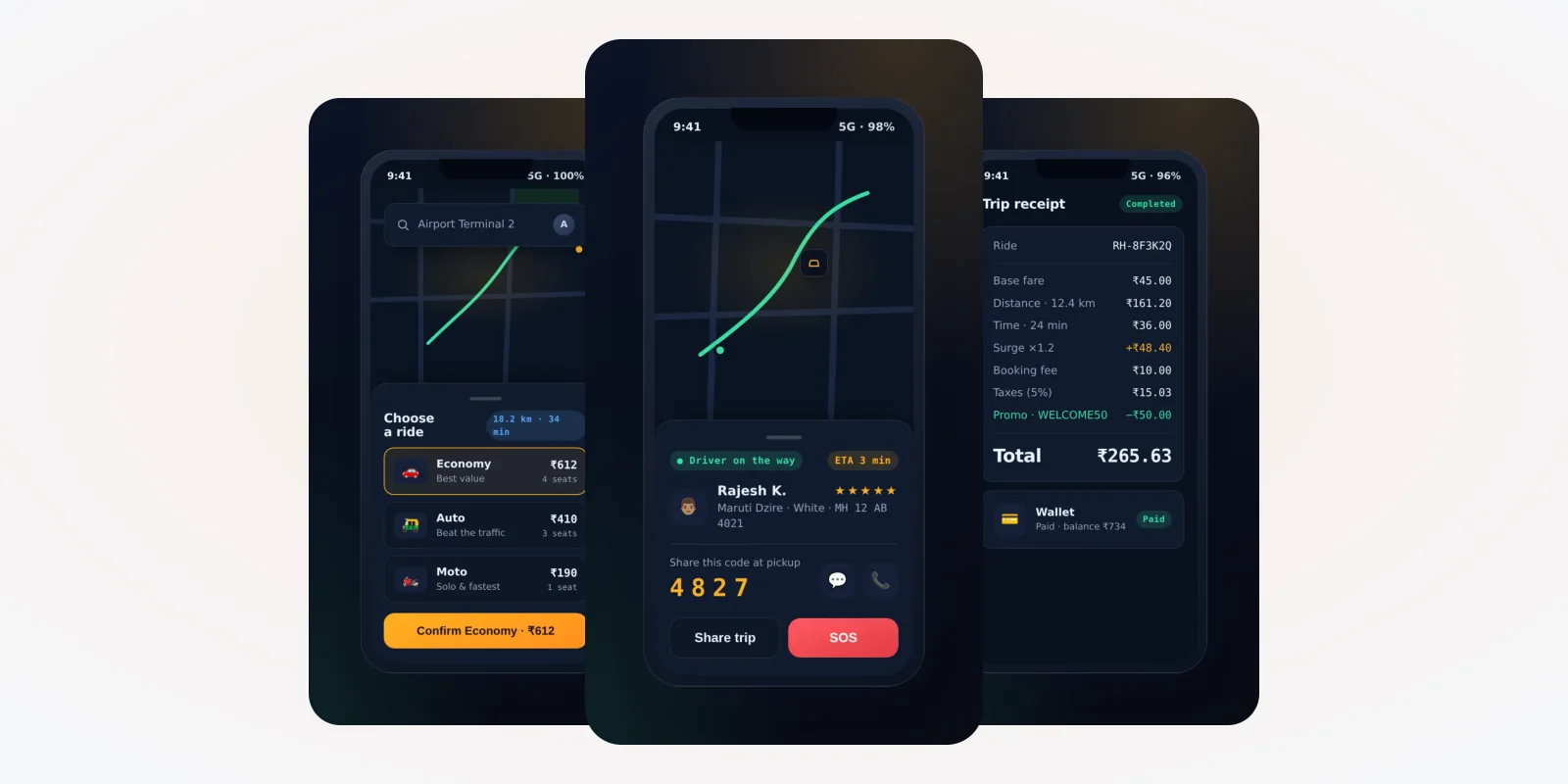
Rider screens: book, track and pay
A rider uses three screens on almost every trip.
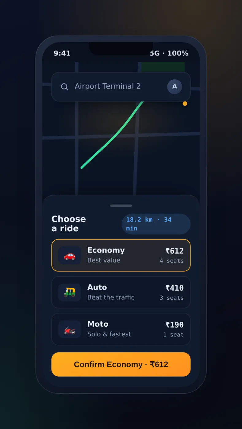
Book a ride
The map takes most of the screen. The destination box sits on top. Car choices and the confirm button sit in a panel at the bottom.
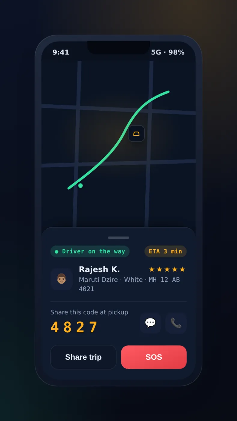
Live trip
The driver's name, car, rating and a pickup code come first. Call, chat, share trip and SOS are one tap away.
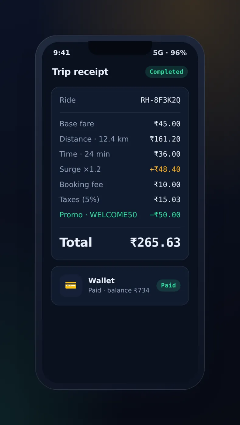
Trip receipt
Each part of the fare is a separate line. Riders who can see how a fare was made do not call support.
Screens from a taxi app we built, demo data.
Rules we follow on the booking screen
- Map first. The rider should see where they are before anything else.
- One main button. Only one action has the strong colour. The rider never has to guess what to tap.
- Remember the usual places. Home, work and the airport should be one tap, not a typed address.
- Show the wait. A rider can accept a longer wait if the screen says how long.
- Keep the fare clear. Show the fare before booking, not after.
Driver app
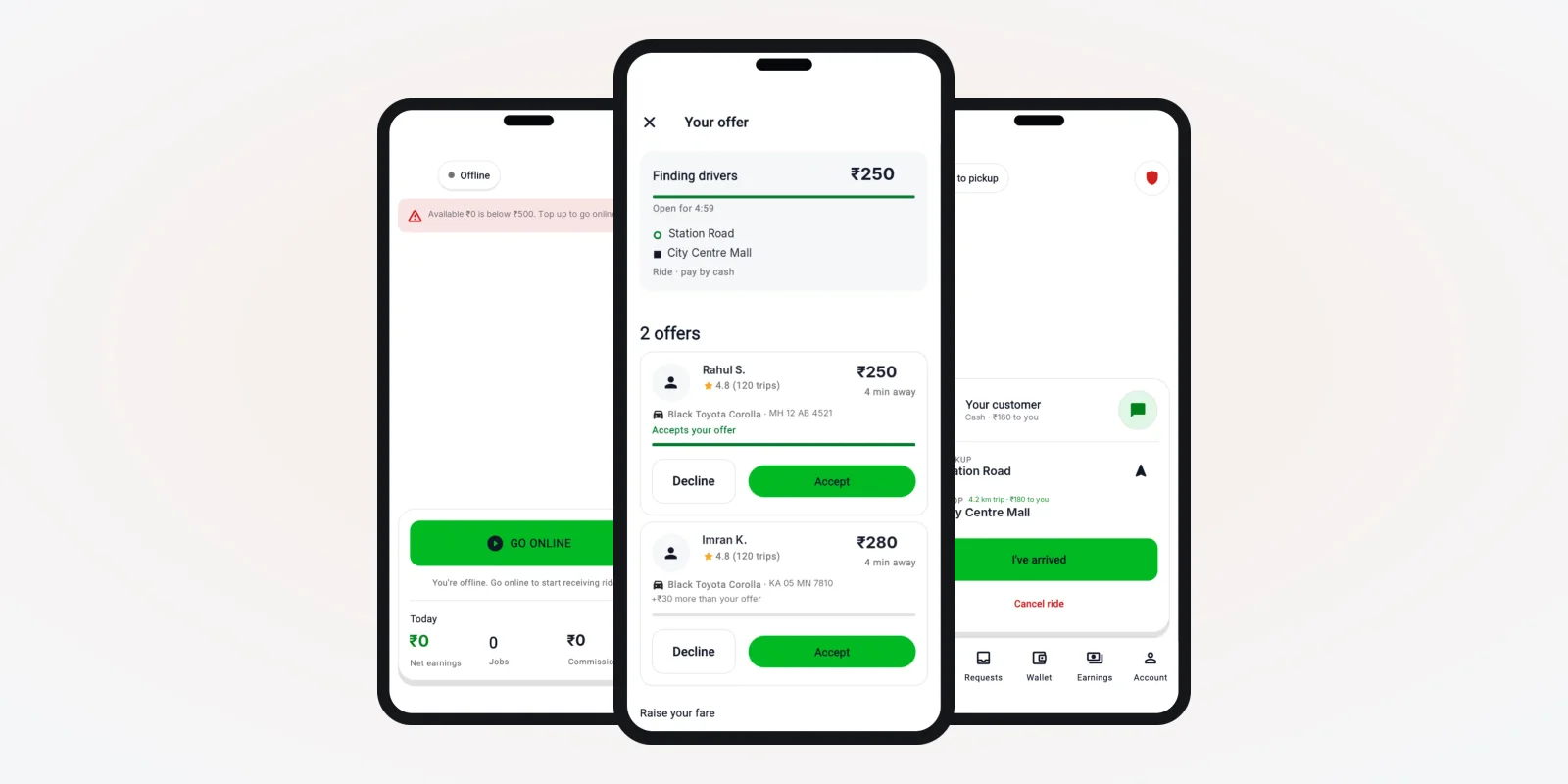
Driver screens: designed for a glance
A driver does not read. A driver glances. So the driver app needs larger text, larger buttons and fewer words on each screen. Colours should still work at night and in sunlight.
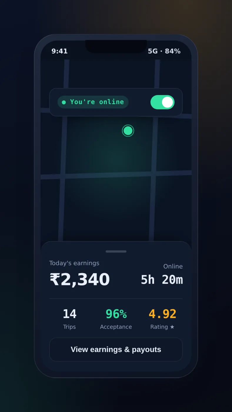
Go online
One switch turns the driver on or off. Today's work shows below it.
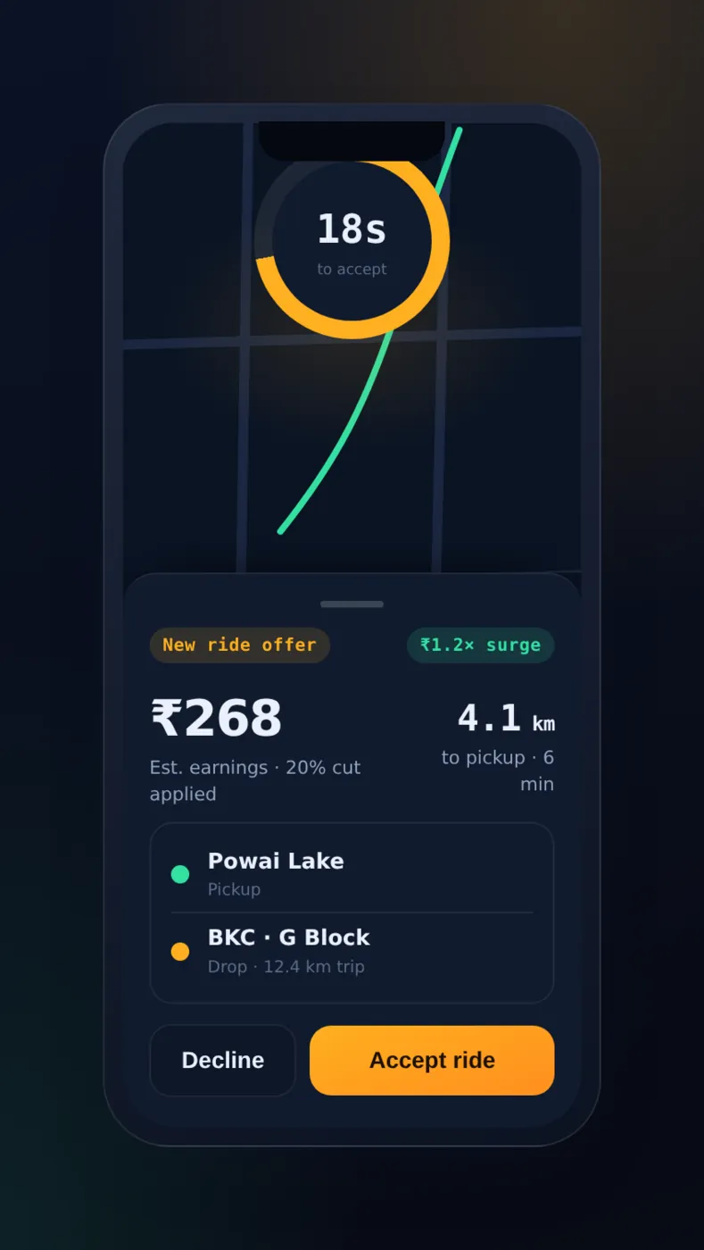
Ride offer
A countdown ring, the pickup and drop points, and two buttons: Accept and Decline.
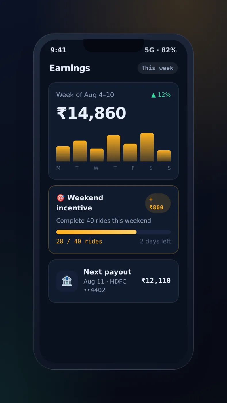
Earnings
A weekly bar chart, targets and the next payout. Drivers check this screen often, so it must be clear.
The ride offer screen is the hardest one to design. The driver has seconds to decide. It should show how far the pickup is, where the trip ends and what the driver earns. It should not show anything else. We also add a clear sound and vibration, so the driver need not stare at the phone.
The driver app also needs a dark theme and a way to keep the screen awake during a trip. These small choices decide whether drivers like the app. We build both apps with Flutter, so one codebase serves Android and iPhone and the two apps stay in step.
Safety and money screens
Two kinds of screens carry more trust than any others. One is about safety. The other is about money. Designers often leave them for last. That is a mistake.
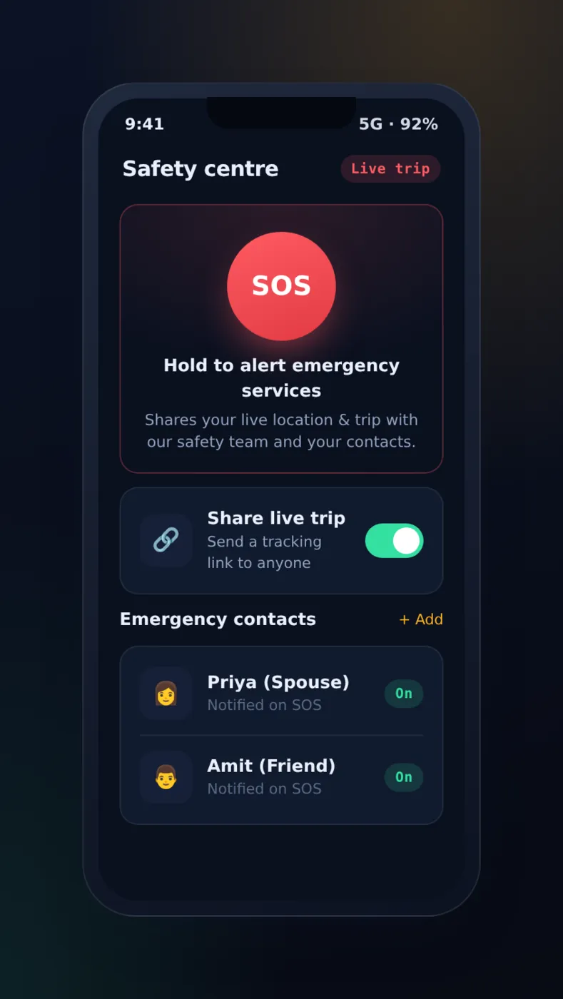
Safety centre
A large SOS button, a switch to share the live trip and a list of emergency contacts.
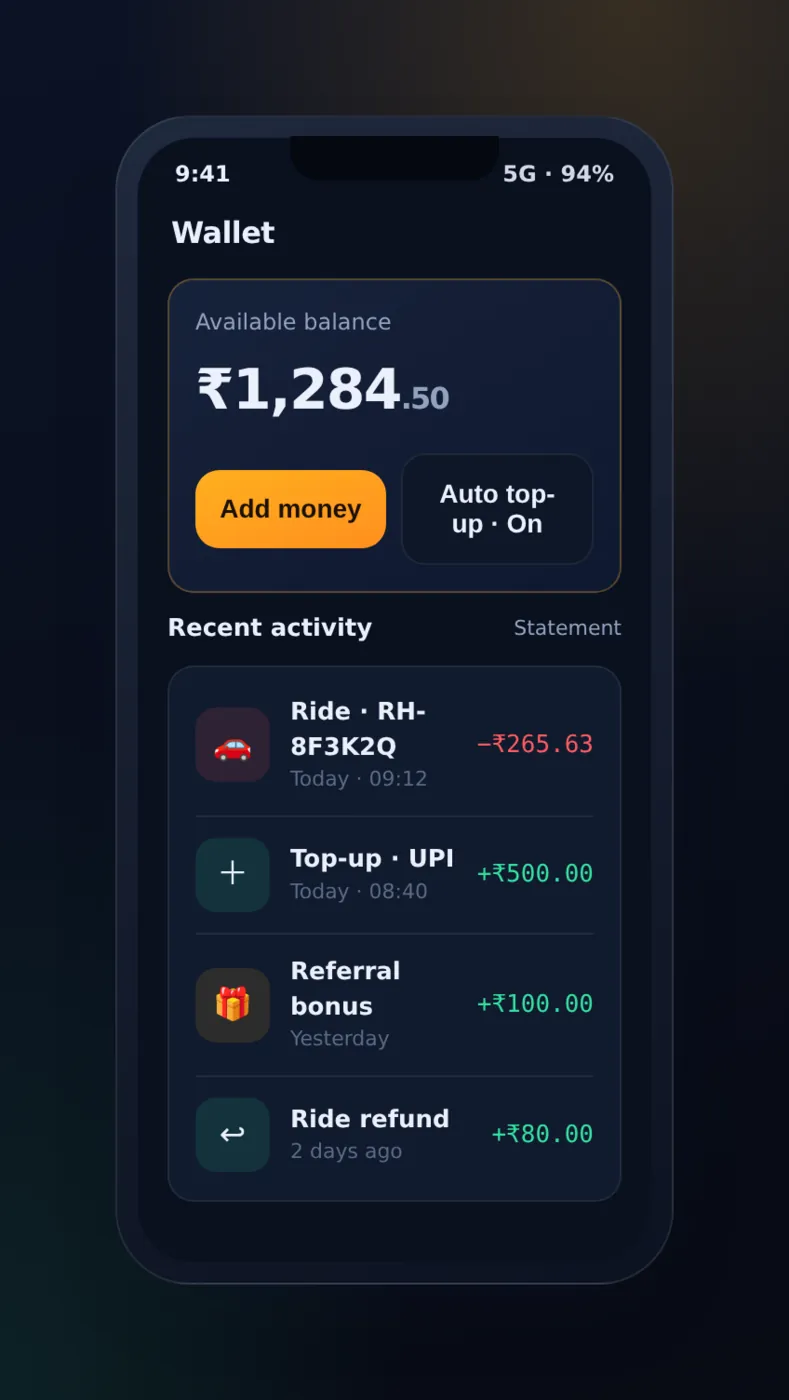
Wallet
Balance, add money, auto top-up and a clear list of every credit and debit.
On the safety screen, the SOS button must be big and hard to press by mistake. We ask the rider to hold it, so a pocket tap does not raise an alarm. For the wallet, every line needs a date and a reason. A rider who sees a charge without a reason will contact support.
Admin panel
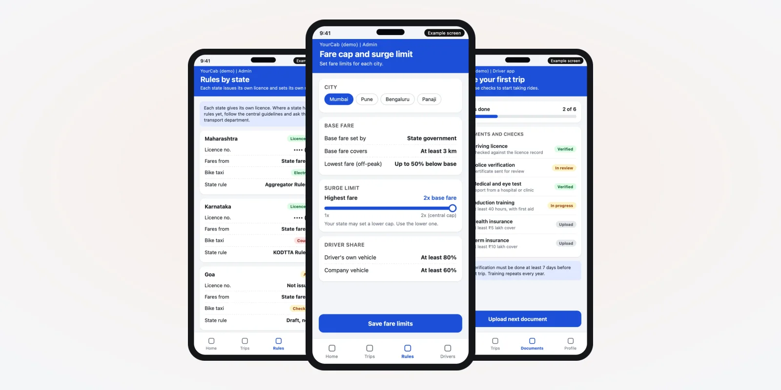
Admin panel screens for the office
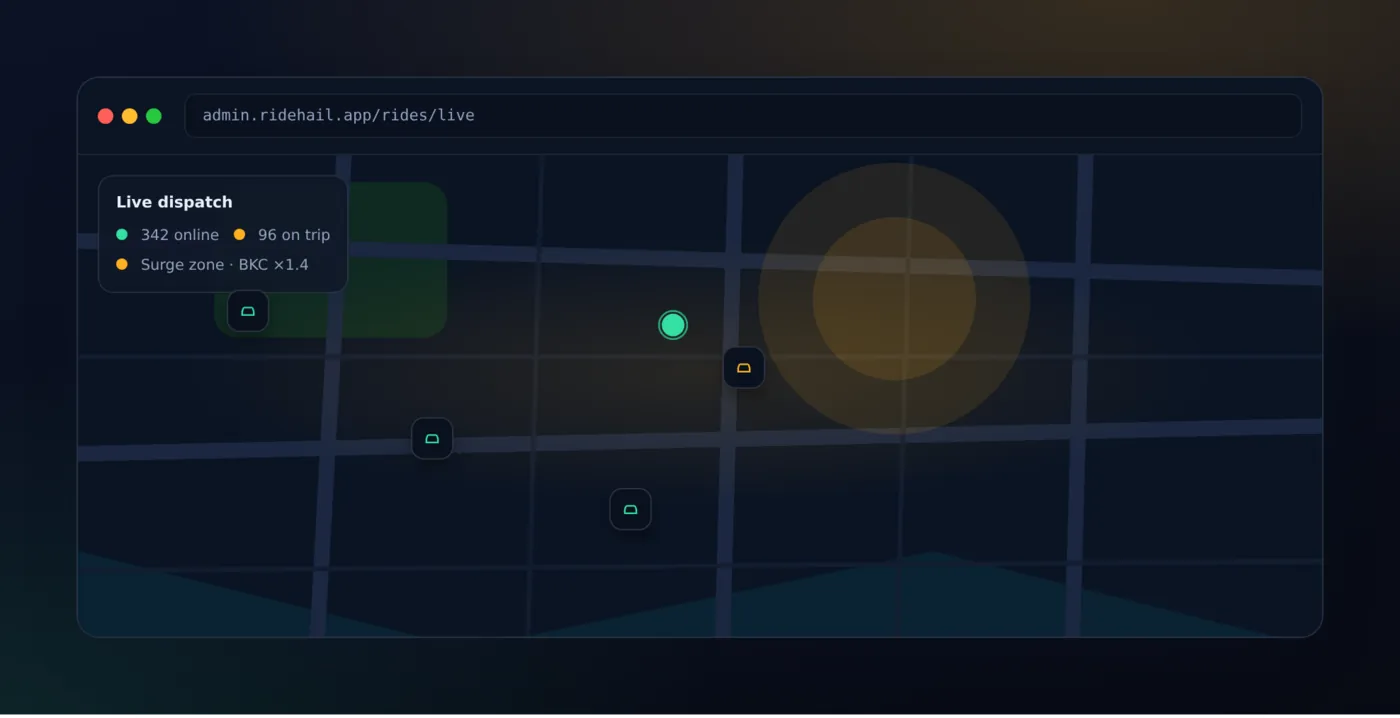
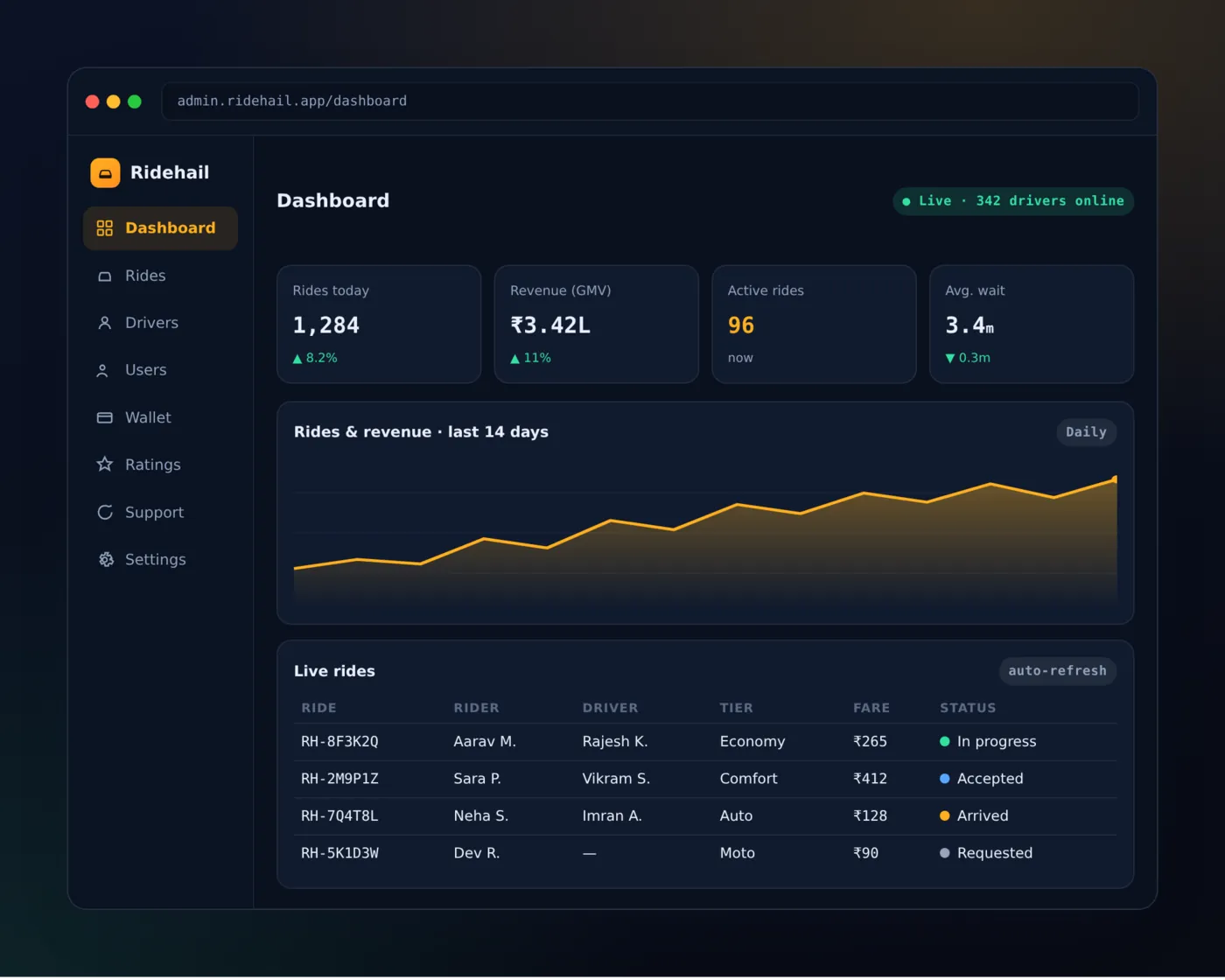
The admin panel runs in a browser on a large screen. Here the design goal changes. The office team needs to scan a lot of information fast, and to act on exceptions. Colour should mean something: late, waiting, problem.
Dashboard
The first screen shows rides today, active rides, average wait and a table of live rides with their status. Filters by city and date help the owner read it in one minute.
Driver approval
New drivers upload licence, vehicle papers and insurance. The team opens each file, marks it verified or pending, and approves or rejects the driver with a note. We design this as one card per document with a status on each.
Admin screens are also where web application development skill matters. Tables, filters and exports must stay quick when the data grows.
Standards your screens should meet
Some design rules are not opinions. The World Wide Web Consortium (W3C) publishes the Web Content Accessibility Guidelines (WCAG). They set out how much contrast text needs against its background, and how large a touch target should be. Both matter in a taxi app, because riders use the phone in bright sun and drivers use it in a moving car.
Source: W3C, Web Content Accessibility Guidelines (WCAG) 2.2. Read the contrast and target-size rules before you approve any colour palette. For a plain-words overview, see the W3C WCAG overview.
Screens also decide how well you handle personal data. India's Digital Personal Data Protection Act, 2023 expects clear consent before you collect data such as live location. That means a consent screen with plain words, not a long block of legal text.
Source: Ministry of Electronics and IT (MeitY), data protection framework. Ask a lawyer how the Act applies to your business.
The problem
Common taxi app design mistakes
- Too much on the booking screen. Offers, banners and menus push the one thing a rider came for off the screen.
- Small text for drivers. A driver cannot read small grey text in a moving car.
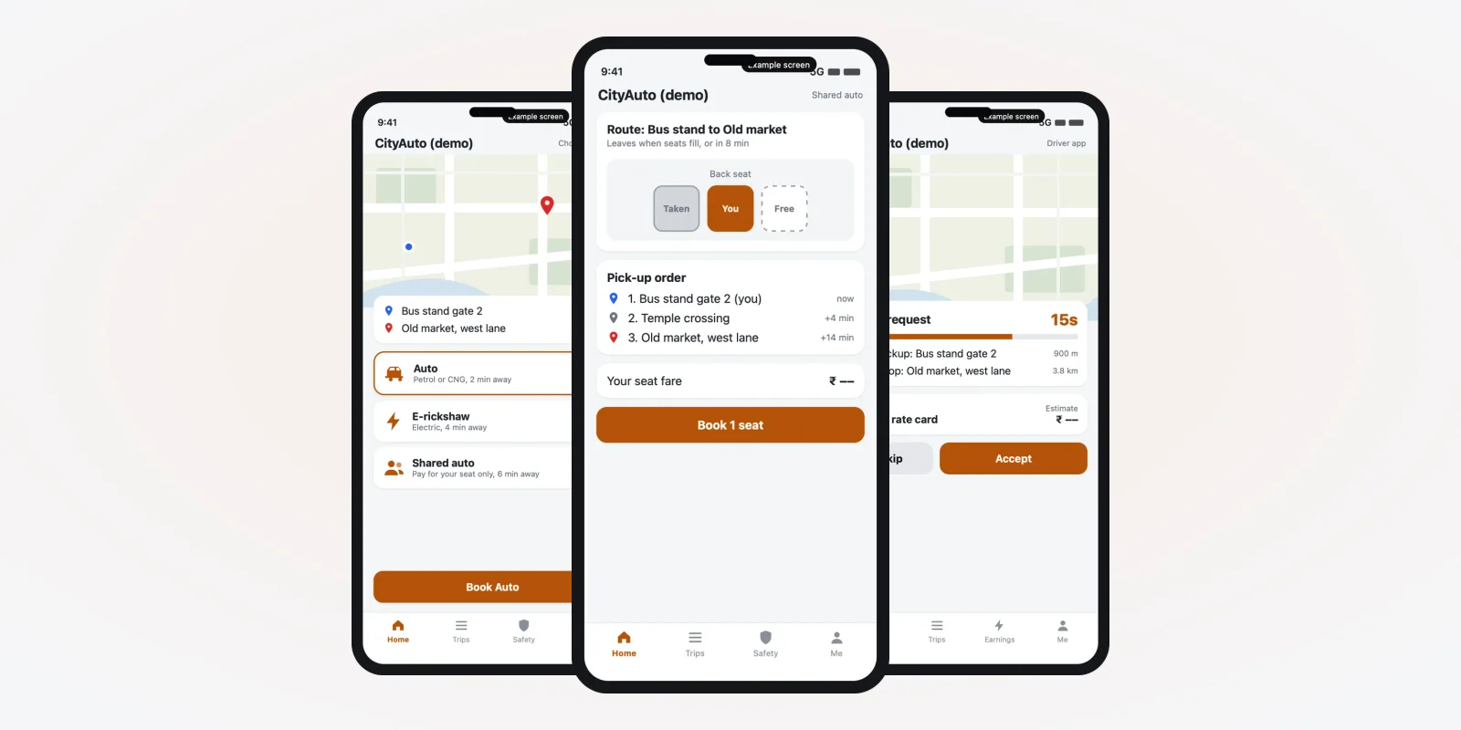
- One design for every city. Airport pickups, railway stations and narrow lanes need their own pickup help.
- No empty and error states. What does the rider see when no driver is free? A blank map loses the booking.
- Hidden fare breakdown. If riders cannot see how the fare was made, they ask support or leave a low rating.
- Admin screens copied from the app. A phone layout on a desk screen wastes space and slows the office.
Custom design vs a ready-made template
Ready-made taxi scripts come with screens already drawn. They are quick to launch, but you work inside their layout. Read our comparison of an Uber clone script and a custom build to see the wider trade-off. For design alone, the difference looks like this.
| Ready-made template | Design made for your business | |
|---|---|---|
| Brand | Your logo on a fixed layout | Your colours, type and icons on every screen |
| Trip types | What the template supports | Airport, outstation, hourly rental or staff trips, as you need |
| Driver app | Same for every buyer | Shaped around how your drivers work |
| Admin panel | Fixed reports and filters | Screens for your office roles |
| Changes later | Wait for the vendor | Your team or ours changes the design files |
If you only want your brand on a ready product, our white-label taxi booking app guide explains that path.
Worked example: an airport cab company
An airport cab company wants an app for travellers. Here is how the design work goes.
- List the trips. Most riders book a pickup from the airport or a drop to it. The home screen shows "To airport" and "From airport" as the first two choices.
- Add pickup help. Airports have set bays and gates. The app asks for the terminal and shows the bay on a small map.
- Show the flight. The rider enters a flight number. The driver app shows it too, so the driver can wait if the flight is late.
- Plan the empty states. If no driver is free, the screen offers a booking for later instead of a blank map.
- Test with real people. Drivers and riders try the clickable screens before any code is written.
Our service
How we design and build your own taxi app
- Understand your business. We ask about your city, your cars, your trip types and your office roles. See our process.
- Draw the screens. We design rider, driver and admin screens in your brand colours.
- Click through them. You and your drivers try the screens on your own phones. We change what does not work.
- Build the apps. We build with mobile app development for Android and iPhone, and a browser admin panel.
- Test with your team. A small group runs real trips before launch.
- Launch under your brand and stay with you. We publish from your store accounts and keep improving the screens.
You can read how earlier work went in our case studies, or see how we build in our guide on making an app like Ola.
Taxi app UI design cost: what decides it
We do not list a fixed price, because every taxi business needs different screens. The design budget depends on:
- How many apps you need: rider, driver, admin, or all three.
- How many trip types you offer, such as city, airport, outstation or rental.
- Whether you need a dark theme and more than one language.
- How many rounds of testing with real drivers and riders you want.
- Whether the design leads into a build with us, or goes to another team.
After one call we send a written quote. If you want a ready base with your brand on it, read about white-label taxi app development too.
Whoever designs your taxi app, make sure you get:
- Three sets of screens: rider, driver and admin
- Clickable screens to test before any code is written
- A driver app with large text and a dark theme
- A safety screen with a hold-to-send SOS button
- A full fare breakdown on the receipt
- Empty and error screens, not only the happy path
- All design files handed over to you
FAQ
What is taxi app UI design?
It is the design of the screens, buttons, colours and text in a taxi app. It covers the rider app, the driver app and the admin panel.
Why does a taxi app need three separate designs?
Riders, drivers and office staff do very different jobs. A rider books, a driver accepts and drives, and the office watches all trips. Each needs its own layout.
How long does taxi app design take?
It depends on the number of apps, trip types and rounds of testing. After one call, we send a plan with dates, starting with clickable screens.
Will the design carry my brand?
Yes. Your logo, colours and fonts go on every screen. The apps are published under your name from your own store accounts.
Do I own the design files and source code?
Yes. We hand over the design files, the source code and the admin panel code. Your data stays in your own cloud account.
Which platforms do you design for?
Android, iPhone and a web admin panel that opens in a browser.
Is rider data safe in the app?
We build consent screens, role-based access and secure storage. Live location is shown only during a trip. India's Digital Personal Data Protection Act, 2023 applies to this data, so ask a lawyer how it affects your business.
Can PRS India design and build my taxi app?
Yes. We design and build the rider app, driver app and admin panel under your brand. Book a consultation to start.
Related guides
- Roadside Assistance App Development: Tow Truck Booking
- Auto Rickshaw Booking App Development: Driver and Rider
- Motor Vehicle Aggregator Guidelines 2025 India: State-Wise Rules
- Car Rental App Development: Self Drive Business Guide
- How to Start Taxi Business: Build Your Own Taxi App
- ONDC Taxi App: How to Build and Launch Yours
- Taxi mobile app development
- UI and UX design services
- Mobile app development
Written by
Aditi
Building software at PRS India.