
Swasthya Sarathi
A healthcare-companion platform for Swasthya Sarathi
A website and mobile app development project for a multi-service healthcare companion — It helps peo...
Read itProduct design and design systems
Research, page layout planning and a design system built in code — not just screenshots. Made to WCAG 2.2 AA, and for a ₹9,000 Android in Kanpur, not a MacBook in a studio.
Last updated
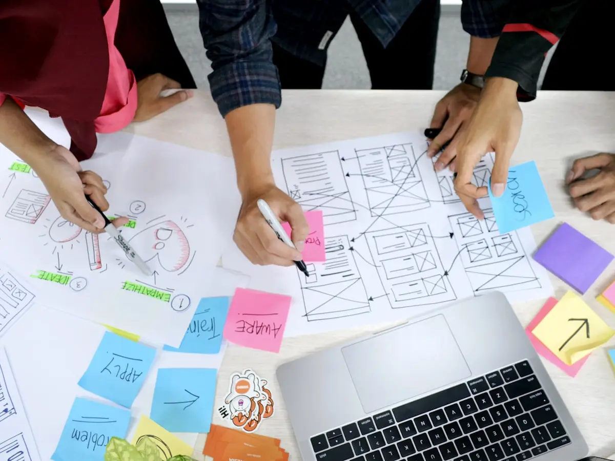
Most of what people call UX in India is a Figma file of eleven nice screens, sent as a PNG. It shows a product on a big screen with fast wifi and no errors. Then the developers build it. They find there is no empty screen, no loading screen, no error screen, and no plan for a 360px-wide phone. So they make it all up at 2am.
We design the other 80%. We draw the screens nobody draws, the steps where money changes hands, the moment the network drops, and the screen a user sees when they have no records. And we give you a design system, with tokens, parts and written rules, not a folder of screenshots. Handoff is where most design work gets lost. So we treat it as real work, not just an email with a Figma link.
Our users are usually not people like us. They are a 42-year-old shopkeeper in Kanpur on a ₹9,000 Android with 3GB of RAM and a weak connection. He fills a form in his second language with the sun on his screen. Design that only works for the person who made it is not design. It is just decoration.
In that order. Jumping to the pretty part is why so much design is built once and never used.
We talk to people who will really use the product, in the place they will use it. We study what they use today, including the WhatsApp group and the paper register that your software is competing with. We look at the data of the old product, if there is one. Research is there to change a design choice. If a study cannot change one, we do not run it.
What are the things in the product, how are they linked, and what must a person remember at each step? Card sorting where the groups are not clear. Menus built around tasks, not around your office chart. That is why most business software is hard to use.
Simple, quick, easy to throw away. We design the steps that carry money or risk with care. We also draw the screens nobody draws: empty, loading, partial, error, offline, no permission, too much data. This is where the real product choices are made, before anyone falls in love with a colour.
Tokens first: colour, type, spacing, corner shape, shadow and motion. Then parts built from them. Then screens built from the parts. Built in that order, it is a system. Built the other way round, it is forty boards that will never match each other.
Five to eight users from your real customer group, on their own phones, do a real task while we watch and say nothing. It feels awkward, but it is the cheapest way to find problems. Every serious problem gets fixed before we build a single part.
Tokens are put into your code repository. A parts library in Storybook has every state written down. You also get notes on how things move and respond, and notes on accessibility. Then we work with your engineers on the first parts. A system that nobody was taught to use falls apart in two releases.
These are the design problems we get called in to fix. Every one of them has a cost.
A new user logs in to a blank grey box and does not know what to do next. You lose them all on the screen nobody drew.
The table has nine columns, the form is two columns wide, and 78% of your traffic is on a 360px phone. Everything looks fine in the studio.
Nobody set a token, so every screen made up its own. Changing your brand colour is now a three-month hunt through old work.
Contrast below 4.5:1, no keyboard focus ring, and status shown only by colour. Fixing it at the end costs six times more than doing it right the first time.
No loading screen, no error text, and no offline plan in the file. So a developer made it up in a rush, and now the product speaks in two different voices.
The steps make sense to the eleven people who built them. The shopkeeper in Kanpur gives up at step three and calls your support line instead.
A design system is not a parts library in Figma. It is a set of choices saved as tokens, and code is where it has to live.
The test is simple. Change your main colour, or make the text bigger, and see what happens. With screenshots, a designer opens forty boards, an engineer opens two hundred files, and three months later something in the checkout is still the old blue. With tokens, you change one value. It flows through Tailwind or CSS custom properties into every part, and the change is one line.
So we save colour, type, spacing, corner shape, shadow and motion as named tokens with clear meaning — surface-raised, not gray-100; text-critical, not red-600 — and we give them to you as code, in your repository, with a parts library where every part lists its states: default, hover, focus, active, disabled, loading, error, empty. The Figma file and the code read from the same source, so they cannot drift apart when the designer leaves the project.
That is the difference between a design system and a mood board with a few rules.
You should never get a design that you then have to work out. If it needs a call to explain, we did it wrong.
Interviews, a study of your rivals, and tests with real users on real devices. We report the choices we made and the ones we changed, not a deck of made-up people.
How things link, menus, groups and the steps that carry money or risk. Built around what a user wants to do, not around who reports to whom.
Colour, type, spacing, corner shape, shadow and motion as tokens, put into your repository as code. Change one value, not two hundred files.
Storybook with every state written down: default, hover, focus, active, disabled, loading, error, empty. Your engineers put screens together. They do not have to guess from PNGs.
WCAG 2.2 AA contrast checked while designing, focus order set, 44px touch targets, no status by colour alone, and ARIA notes for engineers.
Moves that show where a thing came from and where it went, with set timing. We respect the reduced-motion setting, and never animate the key steps.
Accessibility and good speed on cheap phones are the same job: both mean not assuming your user is you.
We design to WCAG 2.2 AA from the start, not as a fix before a government tender. We check contrast while designing: 4.5:1 for body text, 3:1 for large text and button edges. Every button and link can be reached and used by keyboard, with a clear focus ring. Touch targets are at least 44px, because a delivery partner taps with a thumb, in a hurry, on a cracked screen. Nothing shows status by colour alone, because about one in twelve Indian men cannot tell your red from your green.
And we design for the phone that people really have. A 360×640 screen is the main board, not an afterthought. Font sizes allow for Devanagari and Tamil letters, which are taller than English ones and can break a tight line height. Images have a set shape so the page does not jump when they load slowly. Forms accept a phone number pasted with spaces, a pincode typed with a space at the end, and a name with no surname. That is what real Indian data looks like, and rejecting it is a design failure, not a user mistake.
This is the middle result on products where we redesigned a main flow and then measured it against the old version. Nobody can claim a gain they did not measure.
Talk about your productCore flow, measured on real users
Once the token system was in the repo
Empty, loading, error, offline — every screen
Verified with axe on the built product
| A pretty Figma file | A design system | |
|---|---|---|
| Empty, loading and error states | No | Yes |
| Lives in your code repository | No | Yes |
| Rebrand effort | Weeks of digging through old work | One token file |
| Accessibility checked at design time | No | Yes |
| Tested with real users on real devices | No | Yes |
| Engineers have to guess | Constantly | Never |
| Still coherent after two years | No | Yes |
Products where the design worked with real users on real phones.
A fleet, ePOD and route-planning platform that works offline first, for drivers on roads with poor signal. The two ready-made TMS products t...
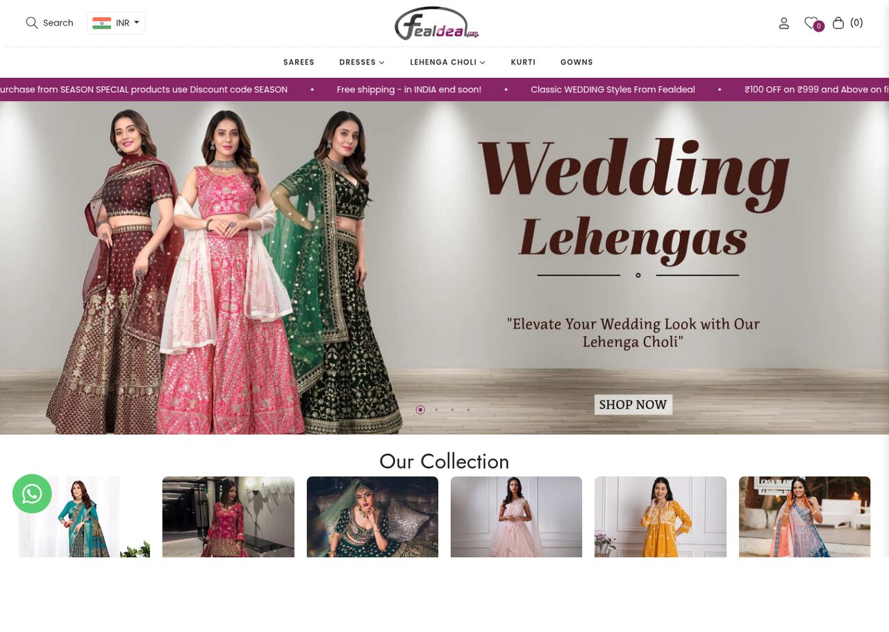
A Shopify store for a Surat ethnic-wear label. It has 200+ SKUs of lehengas, sarees and suits, sorted by type, colour, fabric and work. Shop...
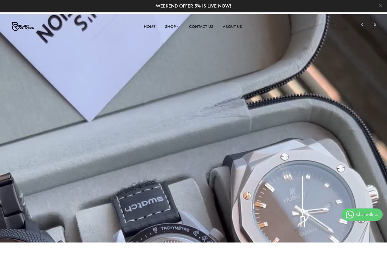
A Shopify storefront for a Surat watch and eyewear retailer — where shoppers can browse by gender, brand, style and combo. It has search tha...
That screen is a design brief. Send it over with the support tickets. We will tell you what is wrong with it, usually in the first reply, at no charge.
Proof
Swasthya Sarathi
A website and mobile app development project for a multi-service healthcare companion — It helps peo...
Read itMV Tech Education
A website development project for a Bihar vocational institute. It is a course list and admissions s...
Read itPatna Taxi
A website development project for a Patna and Muzaffarpur cab operator. It is a fast taxi-booking si...
Read itLive web applications built on Laravel, Next.js and Postgres. They are typed, tested, easy...
ExploreFlutter, React Native and native apps that keep working offline, on old phones and on a me...
ExploreCommerce platforms where the checkout turns visits into sales and the back office numbers...
ExploreLet's talk ui/ux design
A senior engineer reads every enquiry. You'll get a real answer — scope, risk and a number — within one business day.